It’s officially September and it’s 1000 degrees here in Los Angeles. And by 1000 degrees I mean it’s been 100+ for the past five or six days. It’s supposed to cool down soon though so fingers crossed!
For this month’s inspiration, I wanted to focus on contrast and texture which I think are really fitting for fall. When I think about fall, I think about cooler weather, comfy sweaters, warm jackets, the orange and brown leaves. All of these things elicit that fall feeling, and when it comes down to it, a lot of that richness and warmth comes from contrast and texture.
As the leaves change, we have this beautiful yellow and orange detail against the clear blue skies or the gray of an overcast day. And when you go inside, you think of warm, fuzzy blankets, comfy pillows, and bundling up. It’s all contrast and texture when you really get down to it and that’s what inspired these design picks for this month. Hope you like them and Happy September!
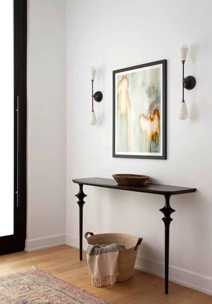
Love this entryway by Bandd Design. It’s simple and refined but still carries a bit of warmth and comfort.
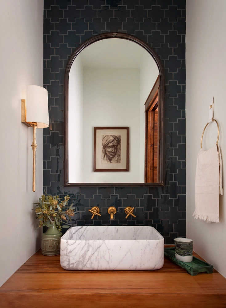
Bandd Design’s at it again with this stunner of a bathroom. The pattern and color of the tile mixed with the wood countertop and marble sink are a lesson in texture and contrast, and it works so well in this space.
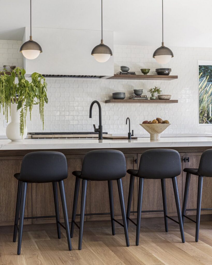
I don’t even care what the rest of this house looks like, I would move in just for this kitchen. The kitchen was designed by Florence Livingston Interiors and I love the color contrast of the darker wood tones with the black and white fixtures and finishes. The wall tile adds a layer of texture to the space and the open shelving adds depth and dimension, which helps tie everything together.
And, my personal favorite, which just sends this kitchen over the top for me, is the extra storage under the island. Do you see all of those cabinets? One of my biggest pet peeves is a kitchen that lacks storage so I love when they turn the extra space under an island into something functional, especially since it doesn’t look like there are any upper cabinets in this kitchen.
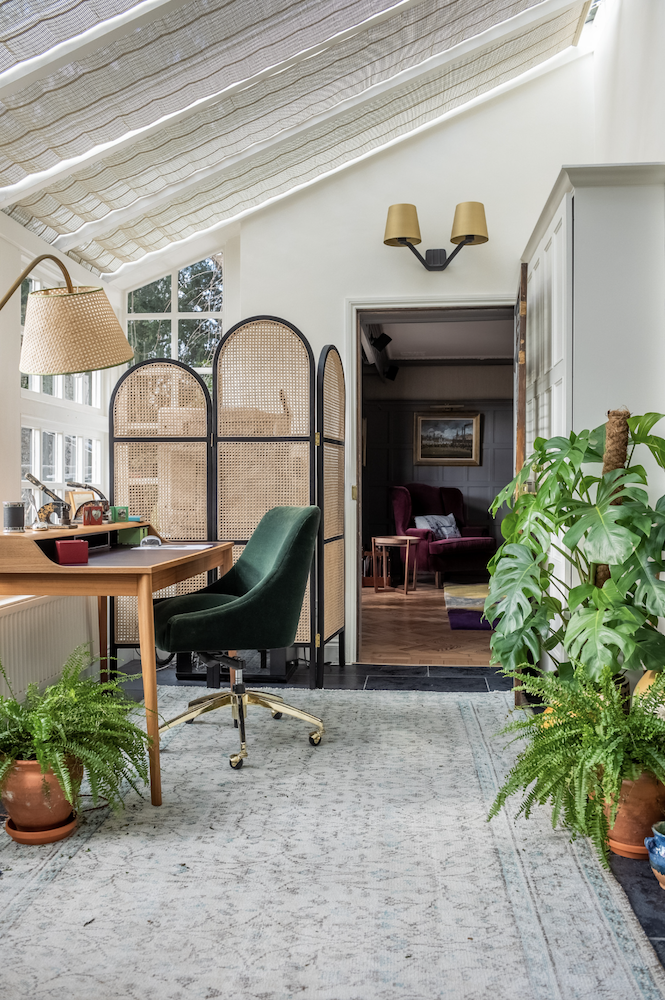
Emilie Fournet Interiors designed this beautiful home and office space and it mixes so many different things. We have wood tones, we have plants, we have suede, we have rattan, we have so many different elements and materials in here that it really comes together to create a comforting, inviting space. I would gladly sit at that desk and write or venture into the room just beyond it and read all day long.

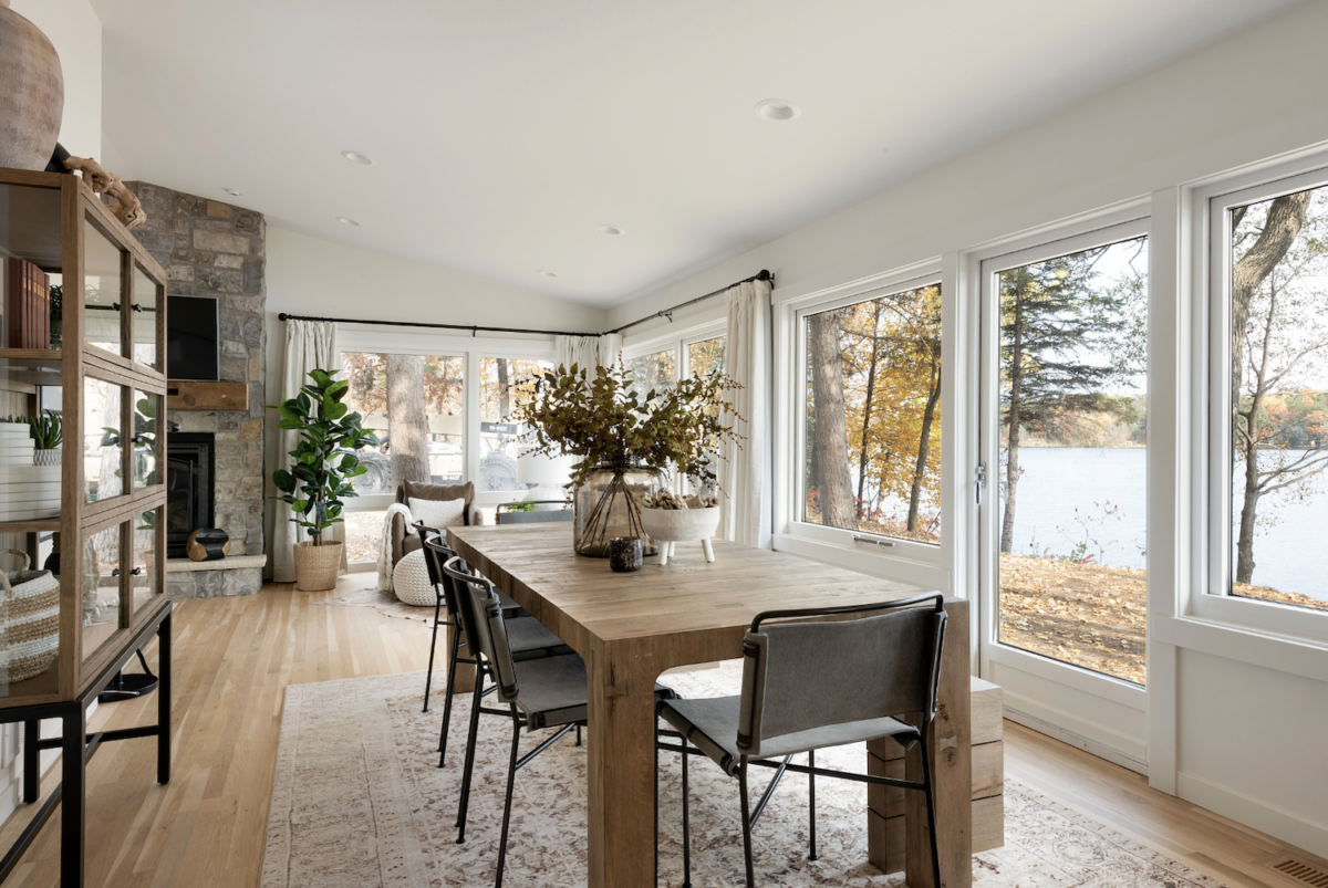
Tays & Co. designed this space and it gives me all the fall feels. Continuing our talk about contrast and texture, this space comes together so beautifully. Looking at the dining set alone, we’ve got a wood table paired with metal and leather/fabric chairs and some decorative glass and ceramic elements to finish it up. It mixes textures and materials and really creates a warm, welcoming feel. And that beautiful view through the windows doesn’t hurt either.
Alright, that wraps up this month’s design inspiration. Hope you enjoyed it! And for next month, get ready for some dark and moody colors just in time for Halloween!